
Backgrounds by Design
Part Two: Interest
Part One here
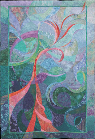
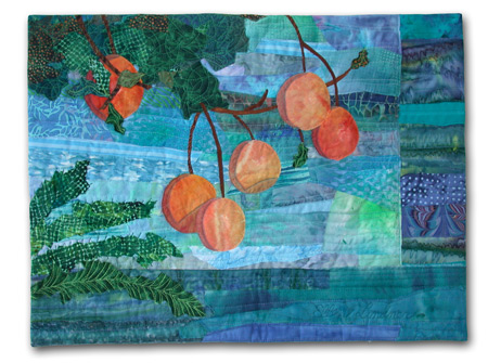
As discussed in part one of this article, one of the primary purposes of a quilt background is to provide contrast with the foreground elements. In addition, each background is also an opportunity to add interest to your quilt. “Hopes and Daydreams” is a perfect example of this. Wouldn’t it be boring if the entire background was one solid piece of blue-green fabric? The variety of
shapes, prints, and colors are big players in the success of this quilt.
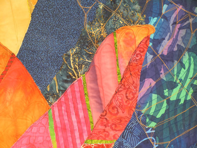
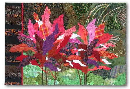
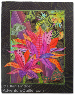
In “Crotons" the background has also been broken up and given interest by the use of multiple fabrics and patterns.
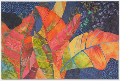
The quilting stage also provides an opportunity for more variety. Especially if there are large spaces that can benefit
from contrasting thread designs. See the detail image below.
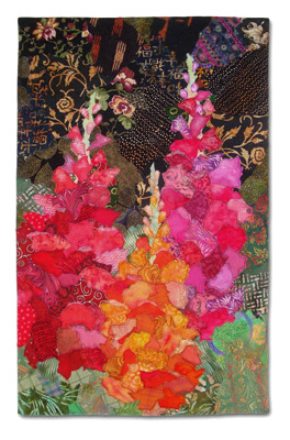
“Snapdragons” takes the idea of printed background fabrics one step further with the addition of highly patterned pieces. The inspiration photo had a tree in the background, which was very dark, with dappled light coming through its leaves.
I thought that value contrast was interesting,
but felt no need to be exact with my colors.
Of course, you can go overboard with this. Too much pattern or color can actually draw attention away from the primary image. The way to avoid this is to audition both background and foreground fabrics together, very early in the design process. Because
it’s always about the combination! No visual decision can be properly made without seeing how it relates to everything else.
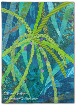
Another way to add interest to the background, and to integrate it well with the foreground, is to include shapes that help tell the story. For instance, the pygmy palm which inspired "Thorns and Berries" included many more thorns in the background. I eluded to these with sharply angled and straight background shapes.
With "The Last Few Dates," the opposite was true. The background was composed of many smooth and curved leaves. Not only did I cut actual leaves in this shape, but I made sure the pieces behind them were similar. Wouldn't it have been distracting if
I'd used the same sharp and angled shapes I used above?
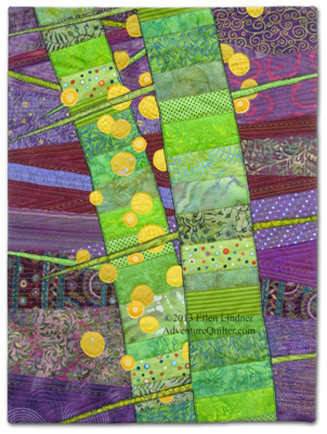
For “Lakeside Citrus”it's easy to see that the undulating and wavy shapes of the background fabrics help to give the
impression of water. There are so many options!
“Ti Plants A-Glow-Glow” utilizes all these ideas. The background has enough pattern to add interest, while the color and values provide contrast. And the shapes hint at busy tropical foliage. Again, I planned for the location of the focal point, the top area of the left plant. Knowing that I wanted a lot of contrast, I was careful to make the background darkest in that area. I kept it all green and black, however, not wanting to distract from the pink plants.
Later, I made another quilt featuring ti plants, "High Ti." This time I wanted to work rather loosely, and also to represent the busy and bright tropical foliage in the vicinity. I included this in the background, even though I knew it would compete with the foreground. It was simply part of the idea I wanted to convey.
The background above comes very close to merging with the foreground, but it was necessary to the story I wanted to tell. Of course, YOU will decide what’s important to YOUR quilt and make design choices accordingly.
Whether your quilt is a representational, abstract, or geometric, you can use these concepts to help your backgrounds work harder for you. Ask these questions:
- How much contrast do you want between the foreground and background?
- What value (lightness/darkness) should it be? Does that need to vary in any areas?
- What color will look best? (Remember that darker, duller colors will help the others to pop.)
- How can you add interest to your background with pattern, multiple fabrics, etc.?
- Finally, are there any areas where the background is attracting more attention than the foreground? What can you do to change that?
Here are a couple more quilts that employ the concepts discussed. Note that the backgrounds by themselves may
not be particularly beautiful. But, they're what's needed in each case.
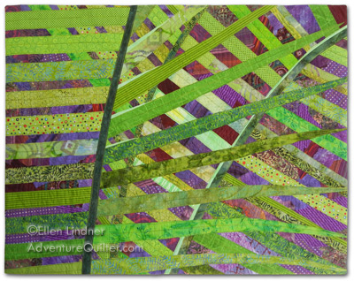
“Crisscross”
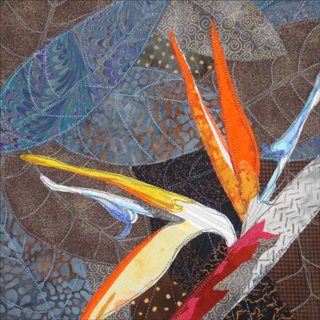
"Bird of Paradise"
The backgrounds of our quilts are VERY important. They visually support and enhance everything else, making them
well worth any quilter’s time and consideration
You may also enjoy a photo essay about the making of my quilt "Ti Plants A-Glow-Glow."
If you found this information useful, you may be interested in my other free articles, online classes, and e-books. You'll find a full directory here.
©2013 Ellen
Lindner
|